graph.config
Links
Here you can consult a detailed description of each graph configurable property as well as the default values of those properties.
Note about performance Some of the properties have a major performance impact when toggled while rendering graphs of medium or large dimensions (hundreds or thousand of elements). These properties are marked with 🚅🚅🚅. ⭐ tip to achieve smoother interactions you may want to provide a toggle to set staticGraph or (better) staticGraphWithDragAndDrop to true Note about granularity Some of the properties listed in the Node section are marked with 🔍. This means that this properties have a higher level of granularity. These properties can be defined in the graph payload at a node level. (sample payload below)
const graph = {
    nodes: [
        {
            id: "id",
            color: "red",         // only this node will be red
            size: 300,            // only this node will have size 300
            symbolType: "diamond" // only this node will have "diamond" shape
        }
    ],
    links: [...]
};
- Graph global configurations
- d3 level configurations
- Node level configurations
- Link level configurations
# Graph global configurations
(boolean
            = false)
🔗
🚅🚅🚅 when true performing a node drag and drop should automatically
rearrange all nodes positions based on new position of dragged node (note:
staticGraph
should be false). A few notes on this property:
- automaticRearrangeAfterDropNode needs to be set before the first graph render. Only the first set value will take effect.
- automaticRearrangeAfterDropNode won't work together with nodeHighlightBehavior (currently a known limitation, to be address in the future GitHub issue #261).
(boolean
            = false)
🔗
🚅🚅🚅 Allow leaf neighbors nodes to be collapsed (folded), this will allow users to clear the way out and focus on the parts of the graph that really matter.
To see an example of this behavior you can access
this sandbox link
that has a specific set up to experiment this feature.
NOTE
: At this moment
nodes without connections (orphan nodes) are not rendered when this property is activated (see
GitHub issue #129
).

(number
= 1)
🔗
zoom that will be applied when the graph view is focused in a node. Its value must be between
minZoom
and
maxZoom
. If the specified
focusZoom
is out of this range,
minZoom
or
maxZoom
will be applied instead.
NOTE
: This animation is not trigger by default. In order to trigger it you need to pass down to
react-d3-graph
the
node that you want to focus via prop
focusedNodeId
along side with nodes and links:
const data = {
nodes: this.state.data.nodes,
links: this.state.data.links,
focusedNodeId: "nodeIdToTriggerZoomAnimation"
};

(number
= 1)
🔗
Possible values: 0, 1 or 2
. This value represents the range of the
highlight behavior when some node is highlighted. If the value is set to
0
only the selected node will be
highlighted. If the value is set to
1
the selected node and his 1st degree connections will be highlighted. If
the value is set to
2
the selected node will be highlighted as well as the 1st and 2nd common degree connections.
(boolean
            = false)
🔗
when setting this value to true the graph will be completely static, thus
all forces and drag events upon nodes will produce not effect. Note that, if this value is true the nodes will be
rendered with the initial provided
x and y coordinates
(links positions will be automatically set
from the given nodes positions by rd3g), no coordinates will be calculated by rd3g or subjacent d3 modules.
| Name | Description |
|---|---|
d3.alphaTarget number
(default 0.05)
|
🔗 see d3-force simulation.alphaTarget |
d3.gravity number
(default -100)
|
🔗
this will define how close nodes are to each other
see d3 reference for forces
.
|
d3.linkLength number
(default 100)
|
🔗 the length of each link from the center of the nodes it joins. |
d3.linkStrength number
(default 1)
|
🔗 see d3-force link.strength |
d3.disableLinkForce boolean
(default false)
|
🔗 Completely disables d3 force link and simulation to re-trigger so that one can obtain precise render of node positions as described by the author @antoninklopp in the Pull Request description . |
| Name | Description |
|---|---|
node.color string
(default "#d3d3d3")
|
🔗 🔍 this is the color that will be applied to the node if no color property is found inside the node itself (yes you can pass a property "color" inside the node and that color will override the this default one ). |
node.fontColor string
(default "black")
|
🔗
🔍 fill color for node"s
|
node.fontSize number
(default 8)
|
🔗 🔍 font-size property for all nodes" labels. |
node.fontWeight string
(default "normal")
|
🔗 font-weight property for all nodes" labels. |
node.highlightColor string
(default "SAME")
|
🔗 color for all highlighted nodes (use string "SAME" if you want the node to keep its color in highlighted state). |
node.highlightFontSize number
(default 8)
|
🔗 🔍 fontSize in highlighted state. |
node.highlightFontWeight string
(default "normal")
|
🔗 fontWeight in highlighted state. |
node.highlightStrokeColor string
(default "SAME")
|
🔗 strokeColor in highlighted state. |
node.highlightStrokeWidth number
(default "SAME")
|
🔗 strokeWidth in highlighted state. |
node.labelPosition string
(default null)
|
🔗
🔍 location to place node label relative to node.
The placement options are:
[note] not specifying a label position will fallback to the original placement scheme of to the right of the node. This is different than the implementation for "right", which has the label shifted very slightly upward compared to the original. |
node.labelProperty (string | Function)
(default "id")
|
🔗
this is the node property that will be used in runtime to
fetch the label content. You just need to add some property (e.g. firstName) to the node payload and then set
node.labelProperty to be
"firstName"
.
This can also be a function!
, if you pass a function here it will be called
to obtain the
label
value on the fly, as a client you will receive all the node information that you passed down into react-d3-graph,
so the signature of the function would be:
function myCustomLabelBuilder(node) {
    // do stuff to get the final result...
    return "label string";
}
Then you just need to make sure that you pass this function in the config in |
node.mouseCursor string
(default "pointer")
|
🔗 cursor property for when some node is mouse hovered. |
node.opacity number
(default 1)
|
🔗 🔍 by default all nodes will have this opacity value. |
node.renderLabel boolean
(default true)
|
🔗 🔍 when set to false no labels will appear along side nodes in the graph. |
node.size (number | Object)
(default 200)
|
🔗
🔍 defines the size of all nodes. When set to a number, the node will have equal height and width.
This can also be an object with a height and width property
when using custom nodes
.
size: 200
// or
size: {
   height: 200,
   width: 300,
}
The actual node dimensions (in px) rendered on screen will be the size value divided by 10. For example, a node size of 200 will result in a node with a height and width of 20px. |
node.strokeColor string
(default "none")
|
🔗 🔍 this is the stroke color that will be applied to the node if no strokeColor property is found inside the node itself (yes you can pass a property "strokeColor" inside the node and that stroke color will override this default one ). |
node.strokeWidth number
(default 1.5)
|
🔗 🔍 the width of the all node strokes. |
node.svg string
(default "")
|
🔗
🔍 render custom svg for nodes in alternative to
node.symbolType
. This svg can
be provided as a string to either a remote svg resource or for a local one.

|
node.symbolType string
(default "circle")
|
🔗
🔍 the
shape
of the node.
Use the following values under a property
type
inside each node (nodes may have different types, same as colors):
[note] react-d3-graph will map this values to d3 symbols |
node.viewGenerator Function
(default null)
|
🔗 🔍 function that receives a node and returns a JSX view. |
| Name | Description |
|---|---|
link.breakPoints Array<Object>
(default [])
|
🔗
🔍 an array of coordinates, each coordinate indicates a breakpoint
where the link will break its natural flow and link to the next breakpoint in the list.
Here's the original feature request
it should give you an idea of the capabilities of this feature.
Note that
this property can only be defined a link level and
not
through the config object.
const data = {
  nodes: [ ... ],
  links: [
    source: 'a',
    target: 'b',
    breakPoints: [{ x: 100, y: 20 }, { x: 20, y: 100 }]
  ]
};
|
link.color string
(default "#d3d3d3")
|
🔗
🔍 the color for links
(from version 1.3.0 this property can be configured at link level).
Note:
there's a current limitation where arrow markers in directed graphs won't have the same color as the link. Again this issue
only occurs for individually colored links, if links are colored globally through
link.color
this won't be an issue
#361
.
|
link.fontColor string
(default "black")
|
🔗
🔍 fill color for link's
|
link.fontSize number
(default 8)
|
🔗 font-size property for all links' labels. |
link.fontWeight string
(default "normal")
|
🔗 font-weight property for all links' labels. |
link.highlightColor string
(default "SAME")
|
🔗
links' color in highlight state, default being the same color as
link.color
.

|
link.highlightFontSize number
(default 8)
|
🔗 font-size in highlighted state. |
link.highlightFontWeight string
(default "normal")
|
🔗 font-weight in highlighted state. |
link.labelProperty (string | Function)
(default "label")
|
🔗
the property that will be rendered as label within some link. Note that
this property needs to be passed along the link payload (along side with source and target). This property can also be a function
that receives the link itself as argument and returns a custom string, similarly to what happens with
node.labelProperty
.
|
link.mouseCursor string
(default "pointer")
|
🔗 cursor property for when link is mouse hovered. |
link.opacity number
(default 1)
|
🔍 - 🔗 the default opacity value for links. |
link.renderLabel boolean
(default false)
|
🔗
when set to true labels will appear along side links in the
graph.
Note:
this will only happen of course if proper label is passed within the link, check also
link.labelProperty
.

|
link.semanticStrokeWidth boolean
(default false)
|
🔗
when set to true all links will have
"semantic width"
, this means that the width of the connections will be proportional to the value of each link.
This is how link strokeWidth will be calculated:
strokeWidth += (linkValue * strokeWidth) / 10; |
link.strokeWidth number
(default 1.5)
|
🔗
🔍 strokeWidth for all links. By default the actual value is obtain by the
following expression:
link.strokeWidth * (1 / transform); // transform is a zoom delta Δ value
|
link.markerHeight number
(default 6)
|
🔗 markerHeight property for the link arrowhead height. Note: this property can only be set in the first mount, it does not update dynamically. |
link.markerWidth number
(default 6)
|
🔗 markerWidth property for the link arrowhead width. Note: this property can only be set in the first mount, it does not update dynamically. |
link.type string
(default "STRAIGHT")
|
🔗
🔍 the type of line to draw, available types at this point are:
|
link.strokeDasharray number
(default 0)
|
🔗 stroke-dasharray The stroke-dasharray attribute defines the pattern of dashes and gaps used to paint the link. |
link.strokeDashoffset number
(default 0)
|
🔗 stroke-dashoffset The stroke-dashoffset attribute defines an offset on the rendering of the associated dash array. |
link.strokeLinecap string
(default "butt")
|
🔗
stroke-linecap
The stroke-linecap attribute defines the shape to be used at the start and end of the link.
The stroke-linecap options are:
|
// A simple config that uses some properties
const myConfig = {
    nodeHighlightBehavior: true,
    node: {
        color: "lightgreen",
        size: 120,
        highlightStrokeColor: "blue"
    },
    link: {
        highlightColor: "lightblue"
    }
};

// Sorry for the long config description, here"s a potato 🥔.
Graph
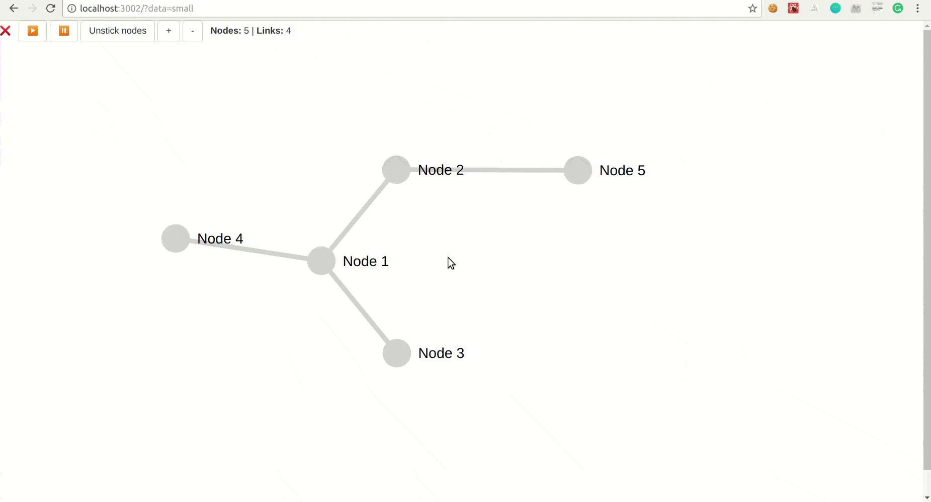
Graph component is the main component for react-d3-graph components, its interface allows its user to build the graph once the user provides the data, configuration (optional) and callback interactions (also optional). The code for the live example can be consulted here
Extends React.Component
(any)
import { Graph } from 'react-d3-graph';

// graph payload (with minimalist structure)
const data = {
    nodes: [
      {id: 'Harry'},
      {id: 'Sally'},
      {id: 'Alice'}
    ],
    links: [
        {source: 'Harry', target: 'Sally'},
        {source: 'Harry', target: 'Alice'},
    ]
};

// the graph configuration, you only need to pass down properties
// that you want to override, otherwise default ones will be used
const myConfig = {
    nodeHighlightBehavior: true,
    node: {
        color: 'lightgreen',
        size: 120,
        highlightStrokeColor: 'blue'
    },
    link: {
        highlightColor: 'lightblue'
    }
};

// Callback to handle click on the graph.
// @param {Object} event click dom event
const onClickGraph = function(event) {
     window.alert('Clicked the graph background');
};

const onClickNode = function(nodeId, node) {
     window.alert('Clicked node ${nodeId} in position (${node.x}, ${node.y})');
};

const onDoubleClickNode = function(nodeId, node) {
     window.alert('Double clicked node ${nodeId} in position (${node.x}, ${node.y})');
};

const onRightClickNode = function(event, nodeId, node) {
     window.alert('Right clicked node ${nodeId} in position (${node.x}, ${node.y})');
};

const onMouseOverNode = function(nodeId, node) {
     window.alert(`Mouse over node ${nodeId} in position (${node.x}, ${node.y})`);
};

const onMouseOutNode = function(nodeId, node) {
     window.alert(`Mouse out node ${nodeId} in position (${node.x}, ${node.y})`);
};

const onClickLink = function(source, target) {
     window.alert(`Clicked link between ${source} and ${target}`);
};

const onRightClickLink = function(event, source, target) {
     window.alert('Right clicked link between ${source} and ${target}');
};

const onMouseOverLink = function(source, target) {
     window.alert(`Mouse over in link between ${source} and ${target}`);
};

const onMouseOutLink = function(source, target) {
     window.alert(`Mouse out link between ${source} and ${target}`);
};

const onNodePositionChange = function(nodeId, x, y) {
     window.alert(`Node ${nodeId} moved to new position x= ${x} y= ${y}`);
};

// Callback that's called whenever the graph is zoomed in/out
// @param {number} previousZoom the previous graph zoom
// @param {number} newZoom the new graph zoom
const onZoomChange = function(previousZoom, newZoom) {
     window.alert(`Graph is now zoomed at ${newZoom} from ${previousZoom}`);
};


<Graph
     id='graph-id' // id is mandatory, if no id is defined rd3g will throw an error
     data={data}
     config={myConfig}
     onClickGraph={onClickGraph}
     onClickNode={onClickNode}
     onDoubleClickNode={onDoubleClickNode}
     onRightClickNode={onRightClickNode}
     onClickLink={onClickLink}
     onRightClickLink={onRightClickLink}
     onMouseOverNode={onMouseOverNode}
     onMouseOutNode={onMouseOutNode}
     onMouseOverLink={onMouseOverLink}
     onMouseOutLink={onMouseOutLink}
     onNodePositionChange={onNodePositionChange}
     onZoomChange={onZoomChange}/>
Obtain a set of properties which will be used to perform the focus and zoom animation if required. In case there's not a focus and zoom animation in progress, it should reset the transition duration to zero and clear transformation styles.
Object:
Focus and zoom animation properties.
This method runs https://github.com/d3/d3-force against the current graph.
undefined:
This method runs https://github.com/d3/d3-drag against the current graph.
undefined:
Handles d3 'drag' event. more about d3 drag
(Object)
if not undefined it will contain event data.
(number)
index of the node that is being dragged.
undefined:
The tick function simply calls React set state in order to update component and render nodes along time as d3 calculates new node positioning.
(Object
            = {})
new state to pass on.
(Function?)
optional callback to fed in to
https://reactjs.org/docs/react-component.html#setstate
.
undefined:
Configures zoom upon graph with default or user provided values.
NOTE: in order for users to be able to double click on nodes, we
are disabling the native dblclick.zoom from d3 that performs a zoom
whenever a user double clicks on top of the graph.
https://github.com/d3/d3-zoom#zoom
undefined:
Handler for 'zoom' event within zoom config.
Object:
returns the transformed elements within the svg graph area.
Calls d3 simulation.stop().
https://github.com/d3/d3-force#simulation_stop
undefined:
This method resets all nodes fixed positions by deleting the properties fx (fixed x) and fy (fixed y). Following this, a simulation is triggered in order to force nodes to go back to their original positions (or at least new positions according to the d3 force parameters).
undefined:
Calls d3 simulation.restart().
https://github.com/d3/d3-force#simulation_restart
undefined:
componentWillReceiveProps
has a replacement method in react v16.3 onwards.
that is getDerivedStateFromProps.
But one needs to be aware that if an anti pattern of
componentWillReceiveProps
is
in place for this implementation the migration might not be that easy.
See
https://reactjs.org/blog/2018/06/07/you-probably-dont-need-derived-state.html
.
(Object)
props.
undefined:
Internal Documentation
This section of the documentation is mainly targeted for contributors working on react-d3-graph. If you're looking into making a change into the codebase this section could give you an organized overview on the library modules.
Offers a series of methods that isolate render logic for Graph component.
Build Link components given a list of links.
Array<Object>:
returns the generated array of Link components.
Function that builds Node components.
(string)
this value contains a string that represents the some currently highlighted node.
(Object)
this object contains a source and target property for a link that is highlighted at some point in time.
| Name | Description |
|---|---|
highlightedLink.source string
|
id of source node for highlighted link. |
highlightedLink.target string
|
id of target node for highlighted link. |
(number)
value that indicates the amount of zoom transformation.
Array<Object>:
returns the generated array of node components
Builds graph defs (for now markers, but we could also have gradients for instance). NOTE: defs are static svg graphical objects, thus we only need to render them once, the result is cached on the 1st call and from there we simply return the cached jsx.
Function:
memoized build definitions function.
Method that actually is exported an consumed by Graph component in order to build all Nodes and Link components.
(Object<string, Object>)
an object containing a matrix of connections of the graph, for each nodeId,
there is an Object that maps adjacent nodes ids (string) and their values (number).
 // links example
 {
    "Androsynth": {
        "Chenjesu": 1,
        "Ilwrath": 1,
        "Mycon": 1,
        "Spathi": 1,
        "Umgah": 1,
        "VUX": 1,
        "Guardian": 1
    },
    "Chenjesu": {
        "Androsynth": 1,
        "Mycon": 1,
        "Spathi": 1,
        "Umgah": 1,
        "VUX": 1,
        "Broodhmome": 1
    },
    ...
 }
(string)
this value contains a string that represents the some currently highlighted node.
(Object)
this object contains a source and target property for a link that is highlighted at some point in time.
| Name | Description |
|---|---|
highlightedLink.source string
|
id of source node for highlighted link. |
highlightedLink.target string
|
id of target node for highlighted link. |
(number)
value that indicates the amount of zoom transformation.
Object:
returns an object containing the generated nodes and links that form the graph.
Offers a series of methods that isolate the way graph elements are built (nodes and links mainly).
Get the correct node opacity in order to properly make decisions based on context such as currently highlighted node.
number:
the opacity value for the given node.
Build some Link properties based on given parameters.
(Object)
the link object for which we will generate properties.
(number)
value that indicates the amount of zoom transformation.
Object:
returns an object that aggregates all props for creating respective Link component instance.
Build some Node properties based on given parameters.
(Object)
the node object for whom we will generate properties.
(number)
value that indicates the amount of zoom transformation.
Object:
returns object that contain Link props ready to be feeded to the Link component.
Offers a series of methods that isolate logic of Graph component and also from Graph rendering methods.
Create d3 forceSimulation to be applied on the graph.
d3-force#forceSimulation
d3-force#simulation_force
Wtf is a force? here
(number)
the width of the container area of the graph.
(number)
the height of the container area of the graph.
(number)
the force strength applied to the graph.
Object:
returns the simulation instance to be consumed.
Receives a matrix of the graph with the links source and target as concrete node instances and it transforms it in a lightweight matrix containing only links with source and target being strings representative of some node id and the respective link value (if non existent will default to 1).
Object<string, Object>:
an object containing a matrix of connections of the graph, for each nodeId,
there is an object that maps adjacent nodes ids (string) and their values (number).
Method that initialize graph nodes provided by rd3g consumer and adds additional default mandatory properties that are optional for the user. Also it generates an index mapping, this maps nodes ids the their index in the array of nodes. This is needed because d3 callbacks such as node click and link click return the index of the node.
Object<string, Object>:
returns the nodes ready to be used within rd3g with additional properties such as x, y
and highlighted values.
Maps an input link (with format { source: 'sourceId', target: 'targetId' }) to a d3Link
(with format { source: { id: 'sourceId' }, target: { id: 'targetId' } }). If d3Link with
given index exists already that same d3Link is returned.
(Object)
input link.
(number)
index of the input link.
(Object
            = {})
Graph component current state (same format as returned object on this function).
Object:
a d3Link.
Some integrity validations on links and nodes structure. If some validation fails the function will throw an error.
undefined:
- any: can throw the following error or warning msg: INSUFFICIENT_DATA - msg if no nodes are provided INVALID_LINKS - if links point to nonexistent nodes INSUFFICIENT_LINKS - if no links are provided (not even empty Array)
This function checks for graph elements (nodes and links) changes, in two different levels of significance, updated elements (whether some property has changed in some node or link) and new elements (whether some new elements or added/removed from the graph).
(Object)
nextProps that graph will receive.
(Object)
the current state of the graph.
Object<string, boolean>:
returns object containing update check flags:
- newGraphElements - flag that indicates whether new graph elements were added.
- graphElementsUpdated - flag that indicates whether some graph elements have updated (some property that is not in NODE_PROPERTIES_DISCARD_TO_COMPARE was added to some node or link or was updated).
Logic to check for changes in graph config.
(Object)
nextProps that graph will receive.
(Object)
the current state of the graph.
Object<string, boolean>:
returns object containing update check flags:
- configUpdated - global flag that indicates if any property was updated.
- d3ConfigUpdated - specific flag that indicates changes in d3 configurations.
Returns the transformation to apply in order to center the graph on the selected node.
(string | undefined):
transform rule to apply.
This function extracts an id from a link. Why this function? According to d3-force d3 links might be initialized with "source" and "target" properties as numbers or strings, but after initialization they are converted to an object. This small utility functions ensures that weather in initialization or further into the lifetime of the graph we always get the id.
(string | number):
the id of the link.
Encapsulates common procedures to initialize graph.
(Object)
Graph component props, object that holds data, id and config.
| Name | Description |
|---|---|
props.data Object
|
Data object holds links (array of Link ) and nodes (array of Node ). |
props.id string
|
the graph id. |
props.config Object
|
same as config in renderGraph . |
(Object)
Graph component current state (same format as returned object on this function).
Object:
a fully (re)initialized graph state object.
This function updates the highlighted value for a given node and also updates highlight props.
(string)
identifier of node to update.
(string
            = false)
new highlight value for given node.
Object:
returns an object containing the updated nodes
and the id of the highlighted node.
Computes new node coordinates to make arrowheads point at nodes. Arrow configuration is only available for circles.
(Object)
the couple of nodes we need to compute new coordinates
| Name | Description |
|---|---|
info.sourceId string
|
node source id |
info.targetId string
|
node target id |
info.sourceCoords Object
(default {})
|
node source coordinates |
info.targetCoords Object
(default {})
|
node target coordinates |
(number)
width of the link stroke
Object:
new nodes coordinates
Offers a series of methods that allow graph to perform the necessary operations to create the collapsible behavior. These functions will most likely operate on the links matrix.
Given a node id we want to calculate the list of leaf connections
(string)
node who's leafs we want to calculate.
| Name | Description |
|---|---|
config.directed boolean
|
tells whether linksMatrix represents a directed graph or not. |
Array<Object<string, string>>:
a list of leaf connections.
What is a leaf connection? A leaf connection is a link between some node A and other node B
where A has id equal to rootNodeId and B has inDegree 1 and outDegree 0 (or outDegree 1 but the connection is with A).
Given a node and the connections matrix, check if node should be displayed
NOTE: this function is meant to be used under the collapsible toggle, meaning
that the isNodeVisible actually is checking visibility on collapsible graphs.
If you think that this code is confusing and could potentially collide (🤞) with #_isLeaf
always remember that A leaf can, throughout time, both a visible or an invisible node!.
(string)
The id of the node to get the cardinality of
boolean:
flag that indicates whether node should or not be displayed.
Update matrix given array of connections to toggle.
| Name | Description |
|---|---|
config.directed boolean
|
tells whether linksMatrix represents a directed graph or not. |
Object<string, Object>:
updated linksMatrix
Node component is responsible for encapsulating node render.
Extends React.Component
const onClickNode = function(nodeId) {
    window.alert('Clicked node', nodeId);
};

const onRightClickNode = function(nodeId) {
    window.alert('Right clicked node', nodeId);
}

const onMouseOverNode = function(nodeId) {
    window.alert('Mouse over node', nodeId);
};

const onMouseOutNode = function(nodeId) {
    window.alert('Mouse out node', nodeId);
};

const generateCustomNode(node) {
    return <CustomComponent node={node} />;
}

<Node
    id='nodeId'
    cx=22
    cy=22
    fill='green'
    fontSize=10
    fontColor='black'
    fontWeight='normal'
    dx=90
    label='label text'
    labelPosition='top'
    opacity=1
    renderLabel=true
    size=200
    stroke='none'
    strokeWidth=1.5
    svg='assets/my-svg.svg'
    type='square'
    viewGenerator={generateCustomNode}
    className='node'
    onClickNode={onClickNode}
    onRightClickNode={onRightClickNode}
    onMouseOverNode={onMouseOverNode}
    onMouseOutNode={onMouseOutNode} />
Some methods that help no the process of rendering a node.
Converts a string that specifies a symbol into a concrete instance
of d3 symbol.
https://github.com/d3/d3-shape/blob/master/README.md#symbol
Object:
concrete instance of d3 symbol (defaults to circle).
Build a d3 svg symbol based on passed symbol and symbol type.
(number
            = 80)
the size of the symbol.
(string
            = 'circle')
the string containing the type of symbol that we want to build
(should be one of
node.symbolType
).
Object:
concrete instance of d3 symbol.
return dx, dy, and potentially alignmentBaseline and textAnchor props to put label in correct position relative to node
"left" | "right" | "top" | "bottom" | "center" | undefined)): ({dx: string, dy: string} | {dx: string, dy: string, textAnchor: string, dominantBaseline: string})(("left" | "right" | "top" | "bottom" | "center" | undefined))
user specified position of label relative to node
({dx: string, dy: string} | {dx: string, dy: string, textAnchor: string, dominantBaseline: string}):
props to put text svg for label in correct spot. default case returns just dx and dy, without textAnchor and dominantBaseline
Link component is responsible for encapsulating link render.
Extends React.Component
const onClickLink = function(source, target) {
     window.alert(`Clicked link between ${source} and ${target}`);
};

const onRightClickLink = function(source, target) {
     window.alert(`Right clicked link between ${source} and ${target}`);
};

const onMouseOverLink = function(source, target) {
     window.alert(`Mouse over in link between ${source} and ${target}`);
};

const onMouseOutLink = function(source, target) {
     window.alert(`Mouse out link between ${source} and ${target}`);
};

<Link
    d="M1..."
    source="idSourceNode"
    target="idTargetNode"
    markerId="marker-small"
    strokeWidth=1.5
    stroke="green"
    strokeDasharray="5 1"
    strokeDashoffset="3"
    strokeLinecap="round"
    className="link"
    opacity=1
    mouseCursor="pointer"
    onClickLink={onClickLink}
    onRightClickLink={onRightClickLink}
    onMouseOverLink={onMouseOverLink}
    onMouseOutLink={onMouseOutLink} />
A set of helper methods to manipulate/create links.
Get a strategy to compute line radius.
CURVE_SMOOTH type inspired by mbostock - Mobile Patent Suits.
(string
            = LINE_TYPES.STRAIGHT)
type of curve to get radius strategy from.
Function:
a function that calculates a radius
to match curve type expectation. Fallback is the straight line.
This method returns the path definition for a given link base on the line type and the link source and target. d attribute mdn
(Object
            = {})
link sourceCoords
(Object
            = {})
link targetCoords
(string
            = LINE_TYPES.STRAIGHT)
the link line type
string:
the path definition for the requested link
A set of constants that facilitate readability regarding links.
Market component provides configurable interface to marker definition.
Extends React.Component
<Marker id="marker-id" fill="black" />
Offers a series of methods to compute proper markers within a given context.
This functions returns the proper marker size given the inputs that describe the scenario where the marker is to be applied.
(number)
the delta zoom value to calculate resize transformations.
(number)
a derived value from the max zoom config.
(number)
a derived value from the min zoom config.
string:
the size.
This function holds logic to retrieve the appropriate marker id that reflects the input parameters, markers can vary with highlight and transform value.
(boolean)
tells us whether or not some element (link or node) is highlighted.
(number)
the delta zoom value to calculate resize transformations.
(Object)
the graph config object.
| Name | Description |
|---|---|
config.maxZoom any
|
string:
the id of the result marker.
This function memoize results for _computeMarkerId since many of the times user will be playing around with the same zoom factor, we can take advantage of this and cache the results for a given combination of highlight state, zoom transform value and maxZoom config.
Function:
memoize wrapper to the _computeMarkerId operation.
Memoized reference for _memoizedComputeMarkerId exposed as getter for sake of readability. Gets proper marker id given the highlight state and the zoom transform.
Computes the three marker sizes For supported shapes in Graph/helper/getNormalizedNodeCoordinates, the function should return 0, to be able to control more accurately nodes and arrows sizes and positions in directional graphs.
(Object)
the graph config object.
Object:
size of markers
Offers a series of generic methods for object manipulation, and other operations that are common across rd3g such as error logging.
Generic deep comparison between javascript simple or complex objects.
(Object)
one of the objects to be compared.
(Object)
second object to compare with first.
(number
            = 0)
this parameter serves only for internal usage.
boolean:
returns true if o1 and o2 have exactly the same content, or are exactly the same object reference.
Function to deep clone plain javascript objects.
(Object)
the object to clone.
(Object
            = {})
carries the cloned output throughout the
recursive calls. Parameter serves only for internal usage.
(number
            = 0)
this parameter serves only for internal usage.
Object:
the cloned object.
This function merges two objects o1 and o2, where o2 properties override existent o1 properties, and if o2 doesn't posses some o1 property the fallback will be the o1 property.
(Object
            = {})
object.
(Object
            = {})
object that will override o1 properties.
(int
            = 0)
the depth at which we are merging the object.
Object:
object that is the result of merging o1 and o2, being o2 properties priority overriding
existent o1 properties.
Given a function, returns a function that will only be called after it stops
being called for time seconds.
(function)
Function to debounce
(number)
Milliseconds to wait before invoking the function if it is called repeatedly
function:
Version of function that will only be called every
time
milliseconds